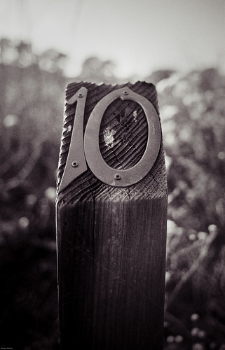
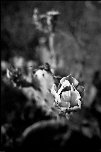
Saves bland monochrome conversions!
Use it!
Also known in the past as T400CN, Portra BW400, and now as Kodak Professional BW400CN (professional my ass, I can find this shit in the local walgreens).
Anyways, it's a monochrome C-41 film that you can get processed at any drugstore minilab. I really think it's a hidden gem in the film world. Ilford made (makes?) a similar film, its name escapes me at the moment (XP2?), but I don't think it gives you as creamy of a texture as the Portra. I'm calling it portra because it's what it was called when I first shot it. to my eye, the emulsions are more or less the same throughout the name changes, so get over it. I've shot every the T400, Portra, and professional versions, so I can testify.
moving on, it's a great film. Lots of dynamic range, though not as good as a silver-halide film developed and printed yourself, and the contrast is right in the middle so you've got the leeway to play with it in post if you have a hybrid A/D workflow like I do. if I didn't have so much neopan, I'd probably be shooting this a lot more. as it stands, I've got 15 rolls of 1600 to burn through, and I don't get out enough at night.
when developed by a lab that knows what they're doing, it looks a lot better than from your drug store minilab. yeah yeah, i know they probably use the same machines to do it, but pro labs definitely take care of theirs better. I'm tellin you, it's worth paying twice the price for a much better negative.
The only downsides to the B&W portra? well, if you're obsessed with Fuji, you're out of luck for an equivalent in their line (maybe acros 100, but that's not C-41. in fact, Acros is a much nicer film, it just doesn't really fall into the same category, and it's cheap at my local lab so i guess I could call it another hidden gem) The fine grain of BW400 is also deceiving—yeah, it's great, but the film itself isn't a high-resolution film. I mean come on, it's sold in drugstores. Think of it as a nice companion to some NPS160 or Portra NC.
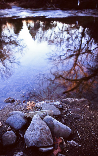
sorry. I just don't understand how people say Velvia is so ridiculously oversaturated. i had to ADD saturation/vibrance to this, along with many of my other slides, just to get them to look like the actual scene that i remember through the lens.
Maybe it's the 100. RVP50 seems a bit more saturated, but only marginally. I still have to add saturation/vibrance to most of those shots, and I scan the two films identically.
could it be the scanner? possibly. but a look at the slides reveals that the scanner only has minimal exposure issues, generally erring to overexposure. so that would make colors lighter and appear more vibrant. again, I just don't get it. and i probably never will until i shoot things other than Velvia. but I get Velvia for free every now and again so I'm really not going to make this a final statement until i shoot something else side by side with it. Maybe some Astia or Ektachrome.
I could just remember things in technicolor or something though.
