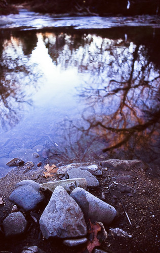
sorry. I just don't understand how people say Velvia is so ridiculously oversaturated. i had to ADD saturation/vibrance to this, along with many of my other slides, just to get them to look like the actual scene that i remember through the lens.
Maybe it's the 100. RVP50 seems a bit more saturated, but only marginally. I still have to add saturation/vibrance to most of those shots, and I scan the two films identically.
could it be the scanner? possibly. but a look at the slides reveals that the scanner only has minimal exposure issues, generally erring to overexposure. so that would make colors lighter and appear more vibrant. again, I just don't get it. and i probably never will until i shoot things other than Velvia. but I get Velvia for free every now and again so I'm really not going to make this a final statement until i shoot something else side by side with it. Maybe some Astia or Ektachrome.
I could just remember things in technicolor or something though.

2 comments:
i also don't think that's oversaturated. actually i prefer b/w, but here the colors add a nice mood.
take care
hannes (dergecko from flickr)
if you like B&W, Velvia looks gorgeous after the conversion to monochrome
Post a Comment